Geneva’s “fi” ligature
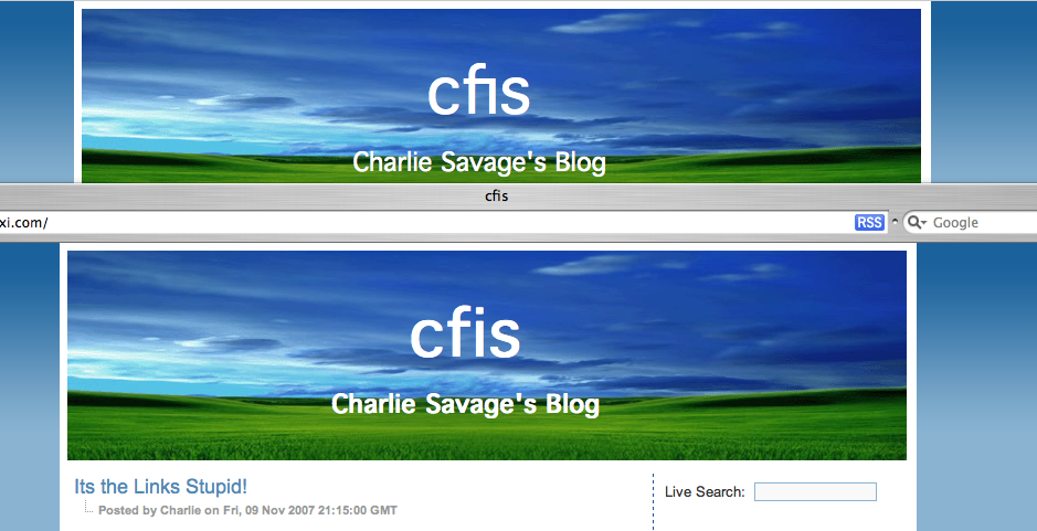
There are good ligatures and bad ligatures, but the “fi†ligature in Geneva is especially bad. This screenshot of Charlie Savage's blog shows Firefox trunk (which supports ligatures) on top and Safari 3 (which does not support ligatures) on the bottom. That thing looks more like a tortured “h†than an “f†followed by an “iâ€, and it makes it look like the blog's title has only three letters.
November 21st, 2007 at 10:19 pm
Too bad our font code can’t teach him the difference between its and it’s in his blog titles.
November 22nd, 2007 at 2:02 am
That is bad. But at that size no ligature is required. Is it really that Safari 3 doesn’t support ligatures, or is it that it had the good sense not to use them at that font size?
November 22nd, 2007 at 2:35 am
>> difference between its and it’s in his blog titles
haha, how embarrassing ;-) perhaps Firefox needs a spell checker and a grammar checker (with a talking paper clip?)
November 22nd, 2007 at 2:58 am
Sounds like a good recommendation to Charlie to not use Geneva.
I was only able to reproduce this on the mac, too. Typing in something like “fine font” gives the ligature, and not that it’s the sexiest appearance in the world, with more reasonable context, reading it isn’t too tricky.
November 24th, 2007 at 12:02 am
Stefanik Gábor has filed bug 404971, “Disable ligatures for sans-serif fonts to fix readability regressions”.
November 25th, 2007 at 12:29 am
It doesn’t really make sense to disable ligatures, since some (non-Latin) scripts require them to be displayed correctly. Complaining about buggy fonts to their makers and distributors seems to be something that Mozilla evangelism project could do, instead.
It would also help if Firefox made it easier to find which font does it use. (With ‘Properties’ of a text selection, for an example.)